3 Basic Principles of Color Theory in Medical Illustration
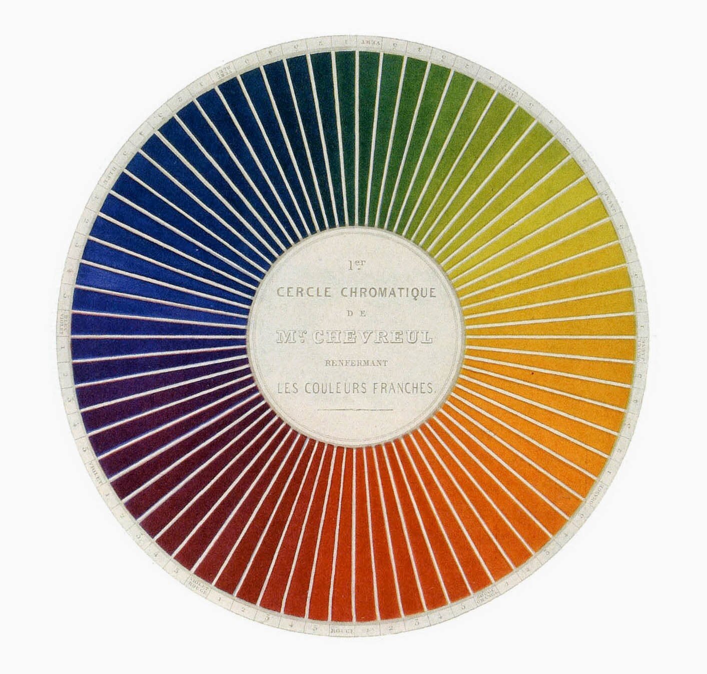
Chevreul’s colour wheel, 1839 Credit: Wikimedia Commons.
Recently we were invited by Dr. Levent Efe, physician-turned-medical illustrator, to present to a group of medical illustrators in Turkey on the topics of color theory for medical illustration. We were honored to do self-exploration about our our work’s relationships with color. In addition, it was an amazing experience to survey the work of illustrators internationally and study the different trends and within color.

Like every creative field, medical illustrations leaches its influences from neighboring to far-spread inspiration. From movies, VFX, fashion, to mobile gaming, we were able to see how these creative influences have impacted not only the visual style over time, but also the level of interactivity with the viewer (ie: gamification & comics are two examples of new vehicles for medical illustration).
Topics we covered included:
Color schemes in medical illustration
Color and light in medical illustration
Design principles in medical illustration
Animation in medical illustration
THE COLOR WHEEL

The first color wheel was designed by Sir Isaac Newton in the 17th century when he was locked away in his England apartment trying to escape the Plague. This original color wheel consisted of:
3 primary colors (red, yellow, blue)
3 secondary colors (colors there are created when primary colors are mixed: green, orange, purple)
6 tertiary colors (colors that are made from primary and secondary colors, such as blue-green or red-violet).
If you draw a line through the middle of the color wheel, you will effectively separate warm colors (red, orange, yellow) from cool colors (blue, purple, green).
2. DIGITAL COLOR

There are many ways too control color digitally. I personally like the HSL slider in Photoshop. A key advantage of HSL over RGB color is that the complementary colors are situated at across the spectrum from each other which makes it easy to use.
Hue: The hue is the dominant color family that a color lies within and is notated by a degree on the color wheel from 0 to 360 degrees like a traditional color wheel. 0 is red, 120 is green, 240 is blue.
Saturation: The saturation is a percentage value of the color’s intensity. 0% means a shade of gray and 100% is the full color.
Lightness: The lightness is dictated by the amount of black and white added to the color. 0% is black, 100% is white.
Other things to consider when adjusting color are tints, tones, and shades which are variations of hues/colors on the color wheel.

Tint: the hue of color with white added. Ex: blue (hue) + white = light blue.
Shade: the shade of a hue is determined by the amount of black added. Ex: blue (hue) + black = navy
Tone: the tone of a color is the amount of grey (black + white) added. It impacts the original hue’s saturation and makes it less intense in vividness.
3. COLOR SCHEMES
Color schemes are intentional groupings of colors that have varying effects on the color combinations and as a result varying effects on the viewer.

Monochromatic: using colors from the same hue by adjusting shades, tints, and tone
Analagous: using colors from the same side of the color wheel
Complementary: pairing 2 colors from opposite sides of the color wheel
Triadic: using 3 colors evenly spaced around the color wheel
Split-Complementary: pairing 2 colors from one side of the color wheel and their complement
IN CONCLUSION:
Color is a powerful tool to guide your viewer’s eye, strengthen your composition, and increase memory retention and understanding of information! As a creative tool that can be used to solve visual problems, the careful selection of color combinations can vary the viewer’s experience therefore, making it a critical component for design and illustration.
Are you interested in having Biotic Artlab come speak to your students or artists? Please send inquiries to info@biotic-artlab.com and we will get back to you shortly.