Diversity, Equity, and Inclusion in Healthcare
Brand Design
A healthcare rebrand to bring a powerful voice to life.
Our client, a U.S.-based Diversity, Equity, and Inclusion (DEI) consulting agency focusing on healthcare, reached out to us to redefine their brand identity and messaging. The team, composed entirely of women DEI specialists, wanted to convey their dedication to fostering inclusivity and equity within the healthcare sector while preserving their distinct identity. They aimed to empower healthcare organizations to embrace diversity and sought a brand narrative that connected with their audience and highlighted their expertise in driving positive change.
Capabilities
Branding
Logo design
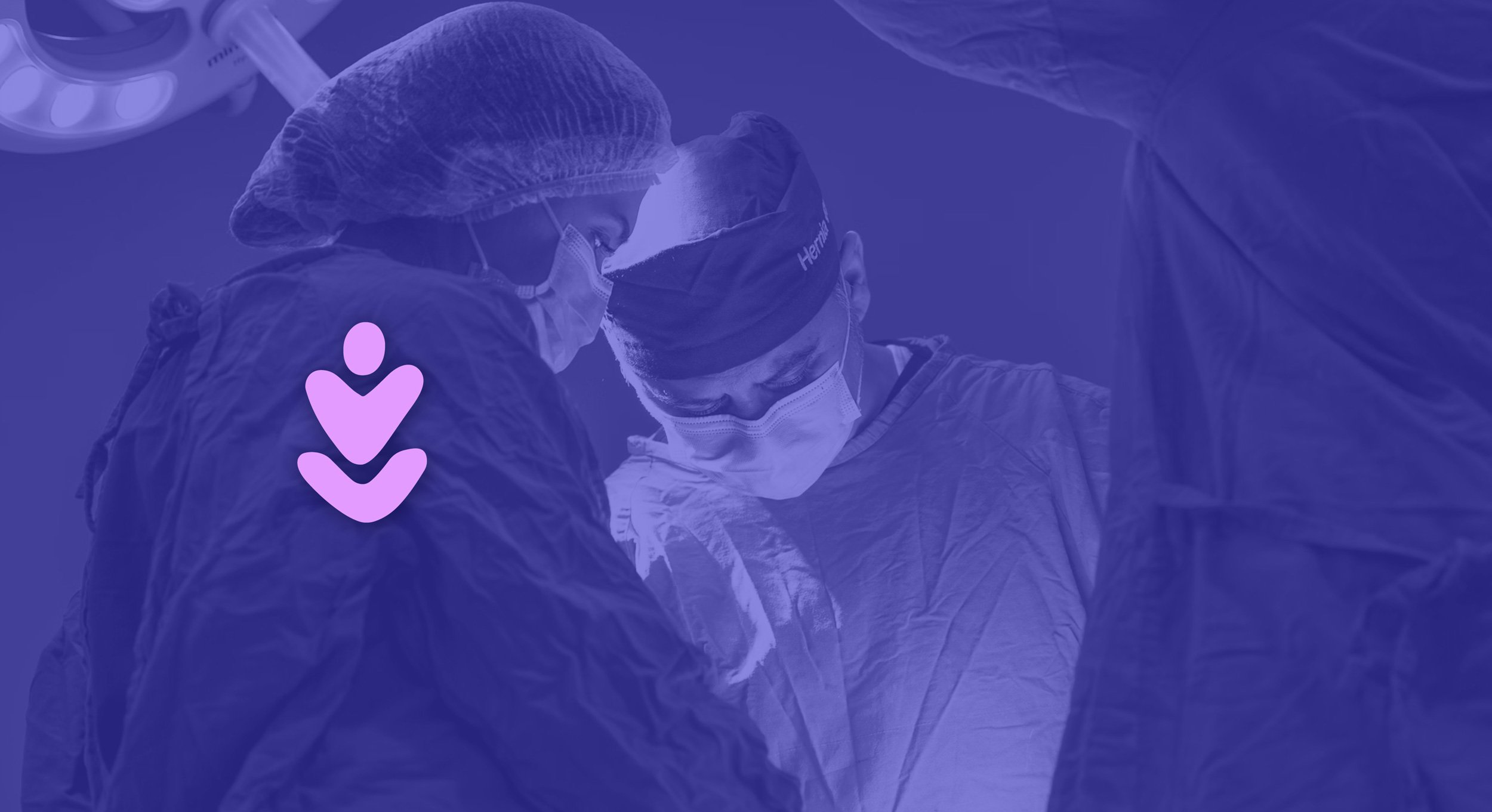
Breaking down the logo: The stylized oak leaf represents justice, fairness, and equity. It includes a character with raised arms, symbolizing accomplishment. The heart-shaped center reflects the company's welcoming and caring attitude. The round, enveloping typography underscores the human-centric ethos and commitment to customer care at the core of the brand.
A bold symbol layered with meaning.


We want to bring your science story to life.
Do you want a brand that fits your voice?